The #FightFor15 is the movement to raise the minimum wage in the United States, and many other countries in the world. I’ve touched on the topic of minimum wage before, first in a 2013 article “Time to Raise The Minimum Wage” and in 2014, “What Wealth Transfer Looks Like” in which I make the case that taxpayers are directly supporting rich shareholders of companies like Walmart by subsidizing their workers’ income so the company can pay substandard wages. I also addressed the objection that “higher minimum wage will result in fewer jobs.”
Now that we are in the midst of tax reform discussion, I find that the minimum wage discussion is inextricably linked to outrage regarding the huge tax cuts the top 1% are bound to enjoy. I understand that the tax code doesn’t address minimum wage, nor does it address healthcare, but there’s no separating them as congress and the senate are both populated by horse traders, always withholding a vote on one issue to get their way on another. If the tax code is about to get changed so the top .2% can save the $100B tax bill their estates might be subject to, it’s only right to discuss how we can help nearly half the US population who are earning a sub-$15 wage.
There’s a cliche that those who don’t study history are doomed to repeat it. Today, this is appropriate to the GOP propaganda suggesting that cutting corporate taxes will “bring back jobs”, “help middle class workers”, and “raise salaries across the board.” This concept was called Trickle Down Economics, and yes, it was proven to have been a failure. Wikipedia offers a Will Rogers quote that gives a bit of perspective:
“This election was lost four and six years ago, not this year. They [Republicans] didn’t start thinking of the old common fellow till just as they started out on the election tour. The money was all appropriated for the top in the hopes that it would trickle down to the needy. Mr. Hoover was an engineer. He knew that water trickles down. Put it uphill and let it go and it will reach the driest little spot. But he didn’t know that money trickled up. Give it to the people at the bottom and the people at the top will have it before night, anyhow. But it will at least have passed through the poor fellows hands. They saved the big banks, but the little ones went up the flue.”
If a clever quote isn’t satisfying, let’s look at some history –
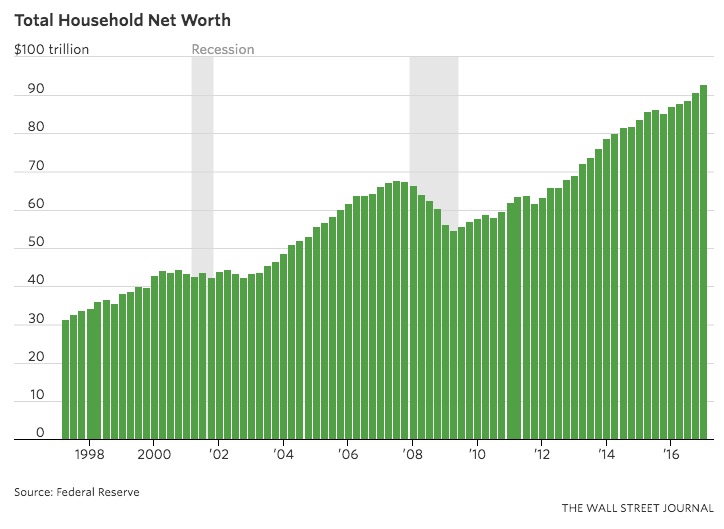
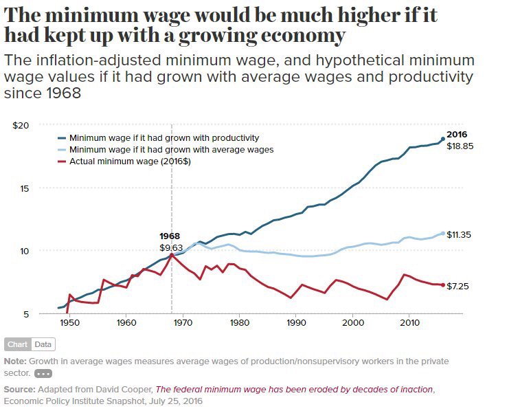 There are two important things to understand in this graph. In relative numbers, average wages have gone nowhere in 50 years. Less than 18% real growth since 1968. Even worse, the minimum wage has fallen in real terms during this time.
Let me offer you a term you might not have hear before, “Velocity of Money.” When I learned this term in grad school, I thought it was great, I imagined money going through the economy getting spent over and over inside of just one year. That’s actually what this phrase means, it’s the total dollar amount of transactions divided by the money in circulation. This raises a major point. $1000 given to a 1%er (Those making over about $400K per year) is just a rounding error, less than a half day’s wages, and just deposited to their checking account. The minimum wage worker is taking the next dollar, the next hundred dollars, and going to the grocery store to buy food. To the department store to replace their kid’s worn out clothing. In other words, it gets spent so fast that it’s gone before the next pay day comes. If trickle down proved a failure, the bottom up approach would provide spectacular results, if only it could be implemented.
Next, let’s consider the GOP’s recent campaign of 31 Reasons for Tax Reform. I plan to write more on this, but today, I’m thinking about how they suggest that cutting corporate taxes will somehow bring back manufacturing (On the page for Aug 7). It’s not tough to find that Ivanka Trump has her products made overseas and for wages that are sub-$1 per hour. There is no reason to expect that any business with a lower tax burden will use that money to create higher paying jobs, it will simply raise their profits. There are classes of manufacturing, clothing for one, that just aren’t coming back. American Apparel has done an admirable job of declaring their manufacturing to be “Sweatshop Free,” and also filed for bankruptcy a second time.
I’ve continued to see people say that the low wage workers should get an education, college, of course, and get a higher paying job. Now, let me show you why this suggest is remarkably ignorant.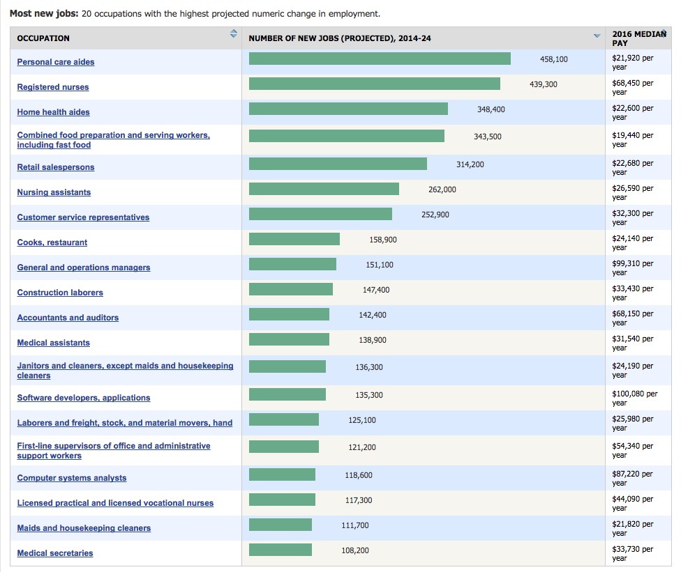
This is a forecast from the Bureau of Labor Statistics. It offers a look at the jobs they expect to grow in number by the most over the next decade, beginning in 2014. What do you see? I’ll tell you the two things that spoke the loudest to me. First, manufacturing didn’t make the list, these are all service jobs. More important, I added the numbers. Of the 4.13M jobs projected, 55% were sub $15, in this case, $26,590 or lower. There is something disingenuous (and innumerate) about the rich person suggesting that it’s possible for everyone to have an above average education and approach an above average wage. Â When I go to a restaurant, I’m not thinking my waitperson should go get a better job, I’m hoping that she is making tips and an overall wage that gives her a good life. It gets even more personal when I visit my mother in law, in an assisted living facility. An average $11/hr for personal care aides who are taking care of our loved ones. The same people saying “go get an education” would be disappointed to find they can’t get any care for their own parents when the time comes. I’ll say it to anyone, I love my mother in law. Unfortunately, we are at a point where she needs the care that can only come from 24/7 heath aides taking care of her. They are not lazy by any means, and deserve to be well paid. You can read the full list above, and hopefully walk away with one message – we need people to do these jobs, and all they ask for is that as wealth in the US grew enormously this past half century, their wages should have kept up. The disparity in the graph I offered above is the creation of a shift in the distribution of income, where the newly created wealth went to the top, at the expense of the middle class.
A few years ago, I read an article, The Pitchforks Are Coming… For Us Plutocrats. Written by a multibillionaire who recognizes that the divide between rich and poor is growing, rapidly. You can read the full article, but I’ll share the most frightening part – “But the problem isn’t that we have inequality. Some inequality is intrinsic to any high-functioning capitalist economy. The problem is that inequality is at historically high levels and getting worse every day. Our country is rapidly becoming less a capitalist society and more a feudal society. Unless our policies change dramatically, the middle class will disappear, and we will be back to late 18th-century France. Before the revolution.” He goes on to say, “In fact, there is no example in human history where wealth accumulated like this and the pitchforks didn’t eventually come out. You show me a highly unequal society, and I will show you a police state. Or an uprising. There are no counterexamples. None. It’s not if, it’s when.”
The most unfortunate thing is that the solution is not difficult, in fact, it’s very simple. A living minimum wage has a remarkable domino effect. When people are not going to bed hungry every night, or making decisions between one necessity and another, local crime goes down. The need for medical care due to malnutrition also goes down. When parents are making enough money to make ends meet on only 80 hours a week combined, Â they are available to their children, and the next generation performs better. We are at a critical juncture in our history, there’s a choice to be made here that will be regarded by historians as either “the moment we decided as a society to eliminate poverty in the US” vs “the new tax code that spoke volumes about being ‘doomed to repeat it’.”