
Decades ago, I read a book titled How To Lie With Statistics, and I was reminded of that book when presented with the graph below, posted at Zero Hedge and titled Party Like it’s 1999?
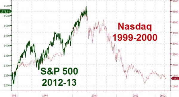
The graph is intended to draw a similarity between the current S&P run-up and the Nasdaq run-up and ensuing crash. A scary coincidence that makes you want to sell right now? Or someone who’s fairly adept with charts pulling a visual fraud?
Have you caught the Big Lie yet? You see, the move from 1250 to near 1600 on the S&P is about 28%. In comparison, the Nasdaq move took it from about 1500 to 4500, a 200% increase. You can easily take any move in the market and with a bit of manipulation, create a chart as you see above. The key in this case is the two different scales, the S&P on the left, Nasdaq on the right. Had the charts been produced using the same scale, they’d show no resemblance to each other.
I’m not making any prediction where the market is heading, only suggesting that when you see a chart, any chart, look carefully at the scales, and don’t let the author fool you.
Nice catch. That was also the time period with the dot-com bust, which I don’t see happening anytime soon with it being pretty much the standard now.
There needs to be some standardization with charts, or having everything in percentages in big numbers. You sometimes see a stock chart with a one or two percentage point increase that looks like it doubled within a few hours. It can be very misleading to people who aren’t familiar.
Well, Daniel, you are right, of course. In this case, a true comparison shows such different percent gains that there’s no comparing the two time periods.
For long periods of time, you want the Y-axis to be a log scale, else recent gains are distorted as true growth over time looks like an exponential curve.
Clearly, the author of this chart meant to deceive.
Great visual. When I see this kind of thing, I always wonder whether it’s ignorance or intentional deception. Honestly, I’m not sure which one is scarier.
I’m thinking this one was absolutely intentional. It would take me a bit of effort to create those two charts, scale them, then overlay the way he did. And all the while, ignoring how different the scale are on either side. My vote is “Evil Genius” over “Ignorance.”
I also read “How to Lie with Statistics” and found it to be a more valuable reference than some of the standard Statistics texts. I concur that there’s no way this was done unintentionally. Too much work. Big question – where did this appear??
This is similar to the fools who confuse correlation with causality
It was posted at Zero Hedge and titled Party Like It’s 1999? There was no discussion beyond that, just the chart.