
The New York Times continues to impress me with how they manipulate data that may otherwise just be a sea of numbers, and transform it into a beautiful chart and/or graph. Click on the image below to launch the Times’ interactive version of the chart, where you can clearly see how each item comprising the government’s shopping list adds to the reported inflation number.
Joe
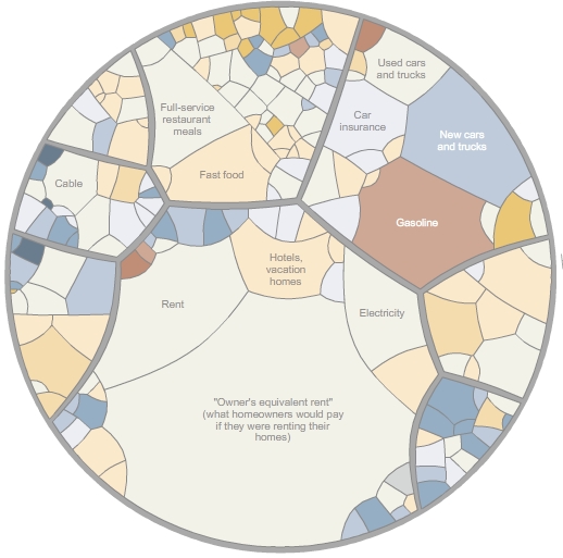
According to the chart under the housing category, spending on “tableware” is up by 5.5%, yet spending on “dishes” is down by 0.6%.
I wonder what this says about the economy.
Regards,
JAL
Interesting enough, I don’t see the cost of increased taxation, in particular property taxes… :-/
No, you’re right, and I hadn’t given that much thought. When viewed at NYT site, those pieces add to 100%, but ignore all taxes, Payroll (FICA), Federal and State, and Property. Makes you wonder.
Joe