
You ever have something pointed out to you, something you never noticed before, and then you see it every place? When I wrote Lying With Charts, I offered one of the most manipulated charts I had come across in some time. There are also many that aren’t manipulated, but are still not quite up to “telling it like it is,” with how they are constructed. First, a disclaimer. I love Forbes Magazine. The articles are top notch, well written, well researched, and when opinion is offered, even when you disagree, you find a strong case made by the writer. The following chart was included in the article March Semiconductor Sales Up Again, and I suspect that the chart is constructed from the numbers, but not by the author of the article itself.
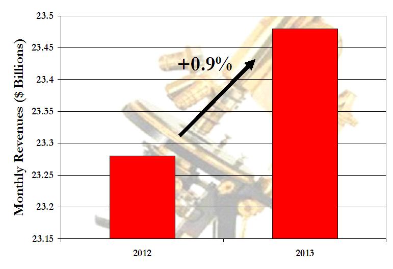
At first glance, the number is up huge. 2-1/2 units to 6-1/2. Not quite, the year on year increase was just under 1%. For all intents and purposes, the chart simply indicates “up.” To be fair, a graphic with two points is tough to construct, especially when changes are so slight. And as I noted, the content and insight of the author’s writing will prompt me to continue reading and just ignore these charts. I think I’ve made my point, and wasn’t planning to turn this into a regular series. Before moving on, though, I’ll offer one more image.
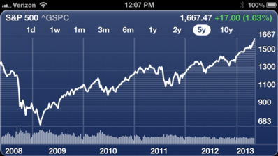
When I look at my iPhone for a chart, it naturally scales it, using the value from the lowest point in the time period as the low x-axis choice. Which, when you think about this, actually would multiply the effect of the distortion of the Forbes graphic above as the the 2012 value would be at the bottom of the chart. In the end, I hope these two articles helped you understand a bit on how to interpret these charts, at the very least, give them more than a brief glance, and understand the data being presented.
Agree.
The failure to provide a zero axis by most of the major providers obscures the true results. At least you can sometimes find a logarithmic display option…
/dave
Nice post. I presume you’ve seen Wikipedia’s article on misleading graphs?
https://en.wikipedia.org/wiki/Misleading_graph
It makes for a fun and informative read.
No, I hadn’t seen it, nice article there. I was introduced to How to Lie With Statistics in grad school, and started thinking on that book recently.
My original belief that these kinds of gurus – either print or TV – manipulate data gets stronger and stronger when I read your article and others’. These people have a big hand in the 2007-2008-2009 stock market demise.